There comes a point in any design project when the client says: "We really like the pear." Wait... what?
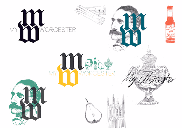
I was asked to design a logo for the My Worcester project by Worcester City Museum and Art Gallery, with a brief to take inspiration from icons of Worcestershire and illuminated manuscripts. Keen to freshen things up a bit, I kept the traditional text clean and bold, and drew such Worcester-centric items as Elgar, Worcester Cathedral, Royal Worcester porcelain and the Worcester Black Pear as a basis from which to work. My initial design sheet full of bits and pieces is shown above, with a couple of developments using these elements below.


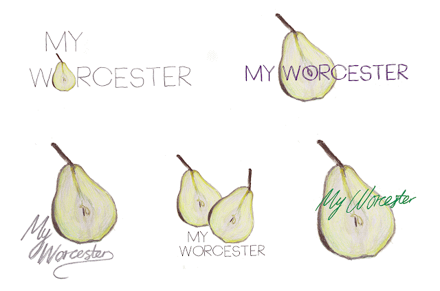
Initial feedback was positive, and I waited to get a consensus from the group about how to move the design forward to best suit their needs. Interestingly they threw me a bit of a curve ball and took a real shine to the pear, asking me to explore the inner colours of the fruit's flesh combined with the project title handwritten in full; further results below. Sorry Elgar, looks like you're out. During a visit to Worcester in 1575, Queen Elizabeth is said to have directed the city to add three pears to its coat of arms, and whilst she didn't say anything about the My Worcester logo, it was nice to take the emblem of a story in a new direction; this little anecdote perhaps considered Worcester's answer to Newton's apple moment. Finally, whilst we're on the topic of Worcester fruit logos, shout out to Worcestershire Orchards for their illustrated offering. Look like my pear is in good company.
Final logo.


No comments:
Post a Comment