

You'd think after making calendars for the last five years I might have gotten the hang of the fact they (at least from a gregorian perspective) tend to start in January. But here I am, just a girl standing in front of her blog, only really beginning to process and psychologically move forward from 2020 (as much as any of us probably can right now), and yet to complete work on my illustrated, designed and printed twelve part offering for the consideration of 2021. I've enjoyed returning to this blog over the years at key moments of stress or sensemaking or satisfaction, and even as a personal record and journal it's quite remarkable to be entering the 10th year of at least some of my thinking and work accumulating in the same url. I sense that I am at a really distinctive point of growth, change and understanding in terms of my creative practice, one that has evolved out of increased responsibilities in my professional life, as well as the innermost personal work on what it means to be me in the world, and really be there, y'know? as my whole self without all the different pieces held together (poorly) with masking tape.

2016: UNREMARKABLE
From my bedroom in my family home in Halesowen, I meticulously researched wikipedia notable events listings for years before finally making this calendar, interested in how to combine my love of curious facts with a suitable print format to act as an illustration series with a practical outcome. I'd been to a beginner's risograph workshop at Rope Press, and had got the idea to make my own calendar following a real love of the format of a large print illustrated number I treated myself to from Rifle Paper Co. (paying as much for the delivery from the USA as I did for the calendar). I didn't have the budget to make anything as fancy as that (I didn't really have the budget to make anything period, but saw it as an important thank you to those who had given me work, and hopefully a investment in good relationships for the future too). The calendar was A4, coil bound, on a cream stock, and I used it as a bit of a first experiment with using different risograph ink colour combinations, as well as bringing some of the points of interest I'd been looking at into something to share with others. I sent copies to Dave Gorman and wikipedia in case they were interested in what I was up to (because if you never try you never know), as well as current clients, supporters and magazines, blogs and organisations that I'd love to do work for or be featured by, as something I felt happy to share as a more realised personal project in a tangible format.

2017: CREATIVE BLACK COUNTRY - Making The Most Of... 2017
Following the debut calendar of 2016, I was commissioned by Creative Black Country to illustrate, design and help produce a calendar for them in a similar style, celebrating their projects and the wonderful people, groups and organisations they'd been working with. The calendar was smaller, and a desktop stand-up format, again produced by Rope Press in Birmingham. This was one of my most significant commissions to date, and one of the first that really felt like I was able to just do it really playfully in my own style, not to mention it feeling really good that the calendar was going to be circulated widely to lots of lovely folks across the area of the midlands that I'm from.

2018: ICONOGRAPHY
The stimuli for this next edition came when I attended transmediale, a Berlin-based festival of art and digital culture, and I heard about the origin of the Lenna test image. I was fascinated by the interconnecting ideas that the story brought with it, and a theme around technology started to emerge, which felt like a natural fit alongside my love of memes and the contrast between my analogue pencil sensibilities. This calendar was designed moreso to be sold and gifted by others, coming in a special metallic gold printed sleeve, along with an exclusive temporary tattoo set and gift card, printed by Rope Press. The paper colour was a microsoft 95 grey and wingdings were used liberally in the design. I learnt a lot from this edition, and production was completed way too late to communicate them in the way that I'd wanted, mostly missing ways to make them available for people to purchase before Christmas. Despite this, it was exciting that people had begun to connect with what I was doing and I'm delighted that those who chose to invest in this edition got something made with a lot of quality and care.

2019: DAILY SPECIALS
Continuing the idea of the gift set, this time I printed the edition with Nottingham-based risograph press Dizzy Ink, keen to use the now annual print project as a means to connect with and support different studios across the region. Using colorplan papers for the first time, as a fun addition I ordered matching cards and drew a different food / drink emoji onto each one. The theme of this calendar was fun but personal, as food was something I was really facing my demons around, beginning therapy for long-standing disordered eating, so it felt like an obvious, yet double-edged choice to explore. I don't know at what point the sequence of colours for the binding consciously became a rainbow, but I definitely deliberately continued the trend with this year's design; turquoise coils meeting strawberry milkshake paper. This year I actually produced them in time to sell at a few markets, including Claptrap Makers Market in Stourbridge, and copies were sent out as gifts by Impact Hub Birmingham.

2020: GREATEST HITS
Of all the calendars, this year was the closest to not happening at all. After a totally KO of a year crowdfunding for and running Brum Zine Fest simultaneously, the physical and emotional labour of closing Impact Hub Birmingham at the end of 2019, it was January and I had no calendar. Originally I'd been researching vinyl sleeves to present a music-themed calendar in, and had been hoping to get it printed in a 12" square format. I tried to think of a way to design it differently, cutting everything back to a single ink colour, something I could print myself quickly at home, a basic binding method and a way to buy myself some time in terms of its design. I utilised 20 clipboards had been used to display quotes at Impact Hub Birmingham, gifting them to those who had co-founded the space or been a key support, the golden yellow paper also inspired by the sunny palette characteristic of the Walker Building space. I immediately focused on creating a music-themed February calendar page and finding mailers big enough to fit the substantial clipboards in, with an accompanying letter about plans to distribute the calendar as individual sheets, page-by-page, month to month. I started to make the first pages available for anyone to download and print, although the increased pressures at work that came from COVID-19 in March meant I mostly focused on trying to keep up with the regular sending of the pages through the mail. There was something really comforting about having a rolling creative task alongside a different kind of work, leadership and responsibility for me as we build CIVIC SQUARE, and crying laughing to myself watching Mr Blobby videos in the middle of the night reminded me how important I find it to offset my serious, anxious energy with humour.
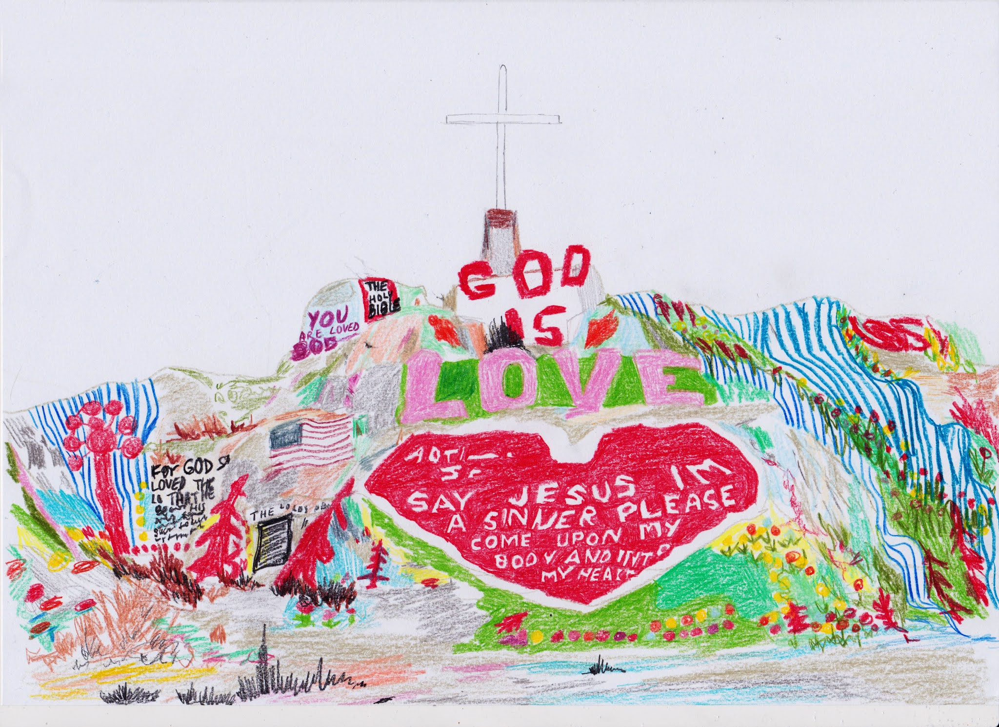
COMING 2021: HOW GREAT THOU ART
Building upon the first printed (un)remarkable calendar, which was accompanied by desktop backgrounds, I think this edition may be designed for screen or printing at home only, due to time and to reflect the current context we find ourselves in. Whatever format it takes, the theme is art, and the illustrations are in full colour rather than a limited palette, with the first completed drawing shown above. Updates to follow soon, god willing.
Thanks for reading, and may the force (but not COVID-19) be with you.
Byng x
No comments:
Post a Comment